G&L Scientific is a global life sciences consultancy supporting pharmaceutical, biotechnology and medical technology organisations throughout the product development lifecycle. As the company expanded its services and international presence, its existing brand no longer reflected the scale, expertise or ambition of the business.
To understand the company’s evolving direction, I worked closely with key stakeholders throughout the project, gathering insight into the business’s services, ambitions, target audience and existing challenges. This helped establish the requirements for the new brand identity and informed decisions around the website’s structure, content and visual direction. Regular discussions and collaborative feedback sessions helped me understand how G&L Scientific wanted to position itself within the life sciences sector, what differentiated its services and how the new brand needed to evolve alongside the business.
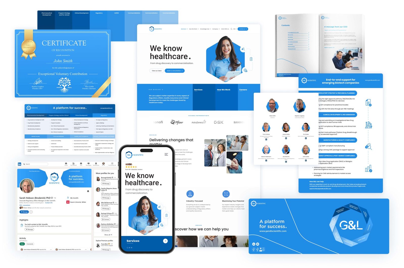
Working as the company’s in-house designer, I led a complete transformation of its visual identity, creating a modern and cohesive brand system across digital and print. This included redesigning the company logo, website, marketing collateral, technical documentation, exhibition materials and supporting graphics, ensuring a consistent customer experience across every touchpoint.
ROLE
Brand Identity Design
UX/UI Design
Graphic Design
PROCESS
Research ➝ Strategy➝ Design➝ Deliver
DELIVERABLE
Responsive Website
YEAR
2024-25
THE PROBLEM
An identity that no longer reflected the business
Originally known as G&L Healthcare Advisors, the company had outgrown both its name and visual identity. As the business expanded into a broader range of scientific and regulatory services, the existing website and branding no longer reflected its evolving position within the life sciences industry. The redesign presented an opportunity to create a modern, cohesive identity that better communicated the company’s expertise, strengthened brand recognition and improved the overall user experience.
KEY PAIN POINTS
01
An outdated visual identity that no longer represented the company’s expertise or growth.
02
A website that made complex scientific services difficult to navigate and understand.
03
Inconsistent branding across digital, print and exhibition materials.
04
A lack of cohesive visual communication across customer touchpoints.
THE CHALLENGE
Create a unified brand experience
The challenge was to modernise G&L Scientific’s visual identity while maintaining the professionalism expected within the life sciences sector. Every customer touchpoint—from the website to printed materials and exhibition graphics—needed to communicate trust, clarity and technical expertise through a single, consistent design language.
KEY SOLUTIONS
BRAND IDENTITY
A modern identity for a growing business
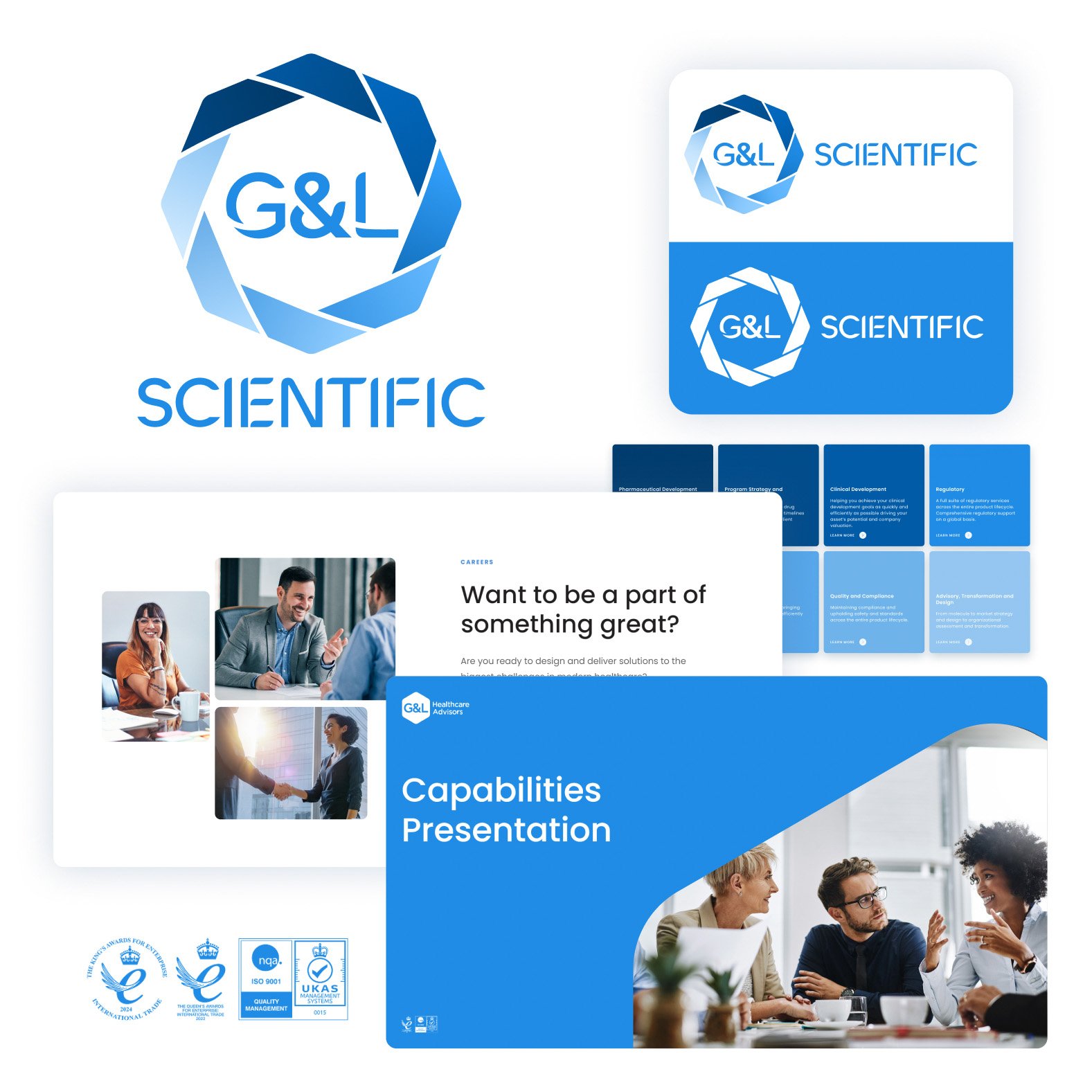
A refreshed logo, typography, colour palette and graphic language established a professional visual identity that reflects the company’s scientific expertise while remaining approachable and recognisable.
WEBSITE REDESIGN
Simplifying complex information
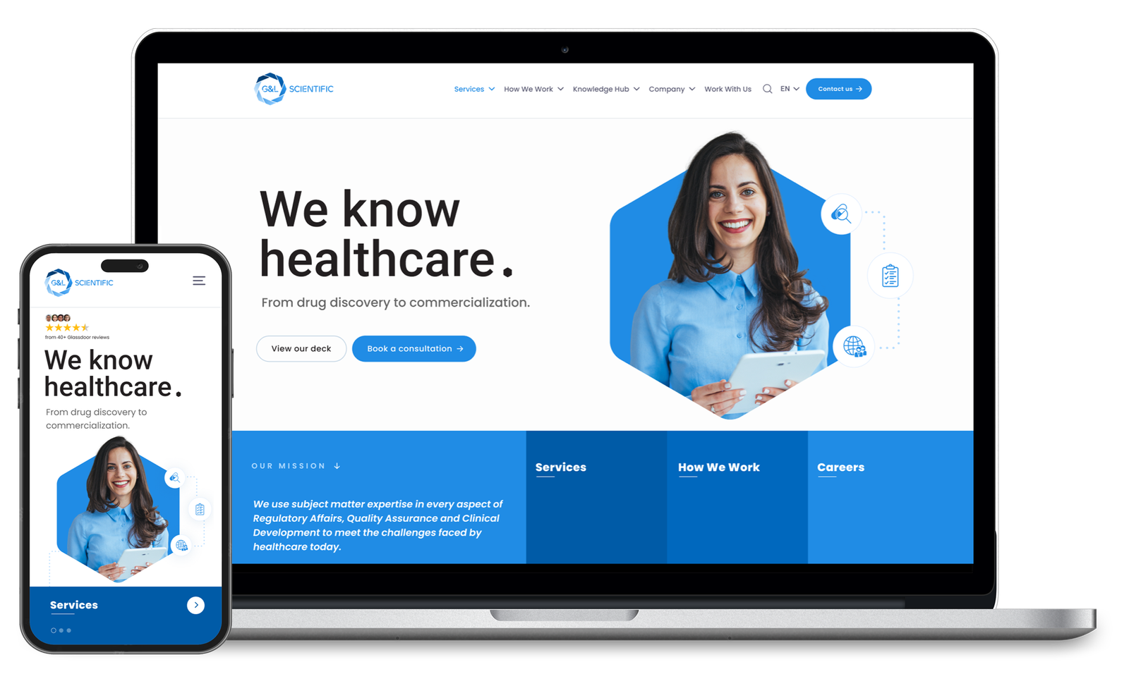
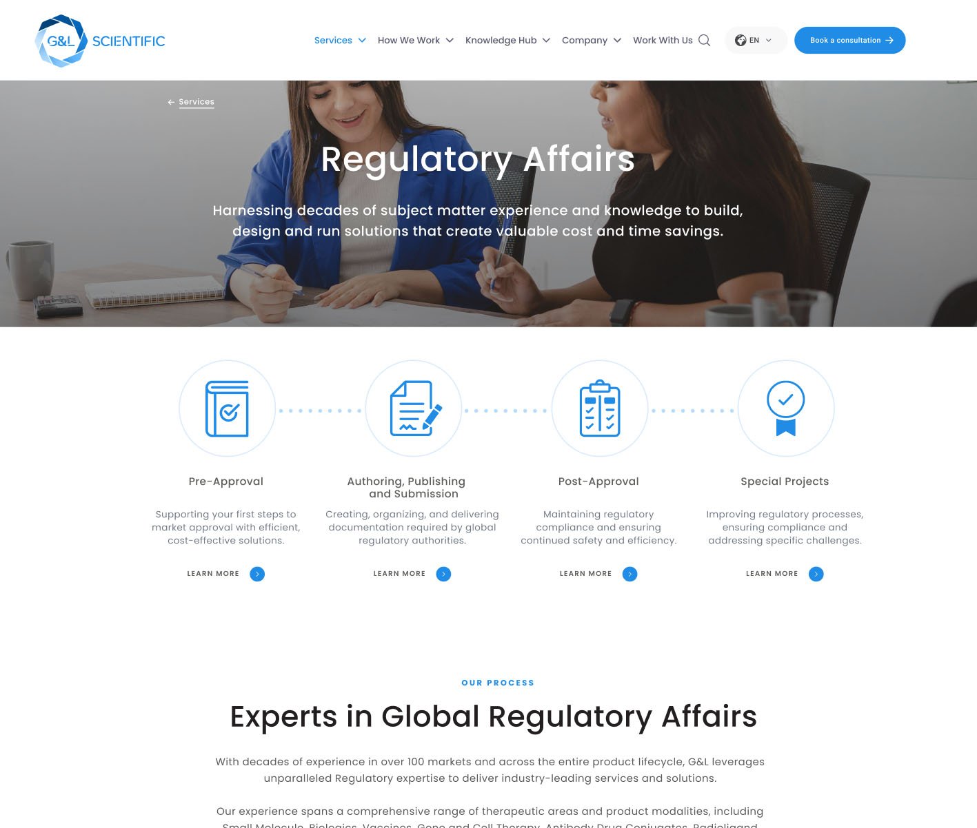
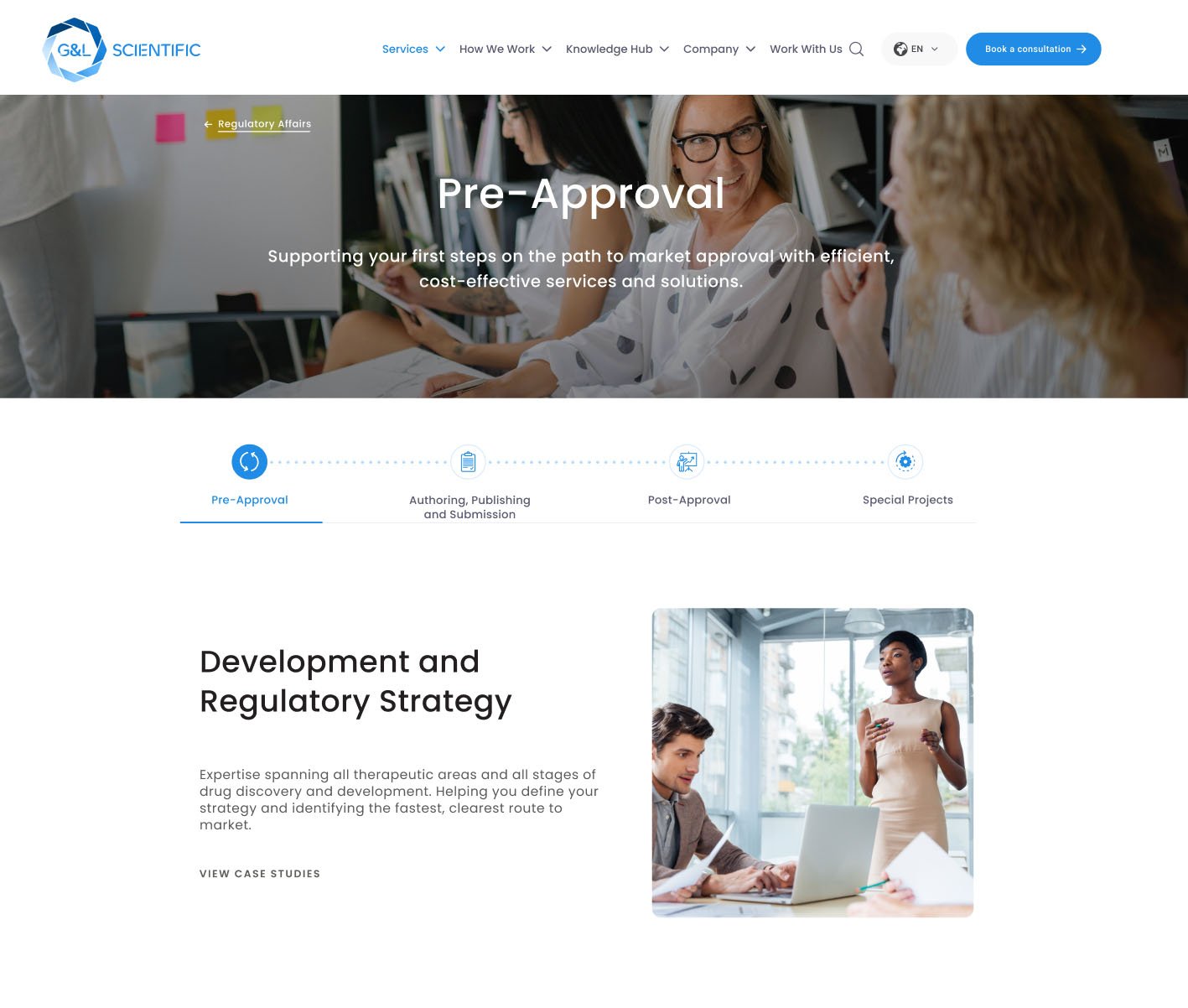
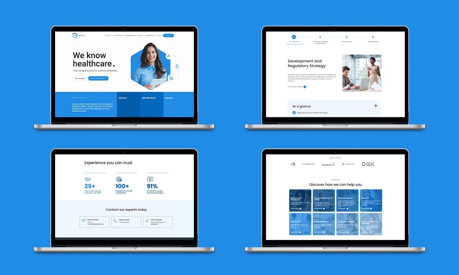
The website was completely restructured to improve navigation, content hierarchy and readability, helping visitors explore specialist services more efficiently and understand the company’s capabilities.
SOCIAL PROOF
Building trust through real-world experience
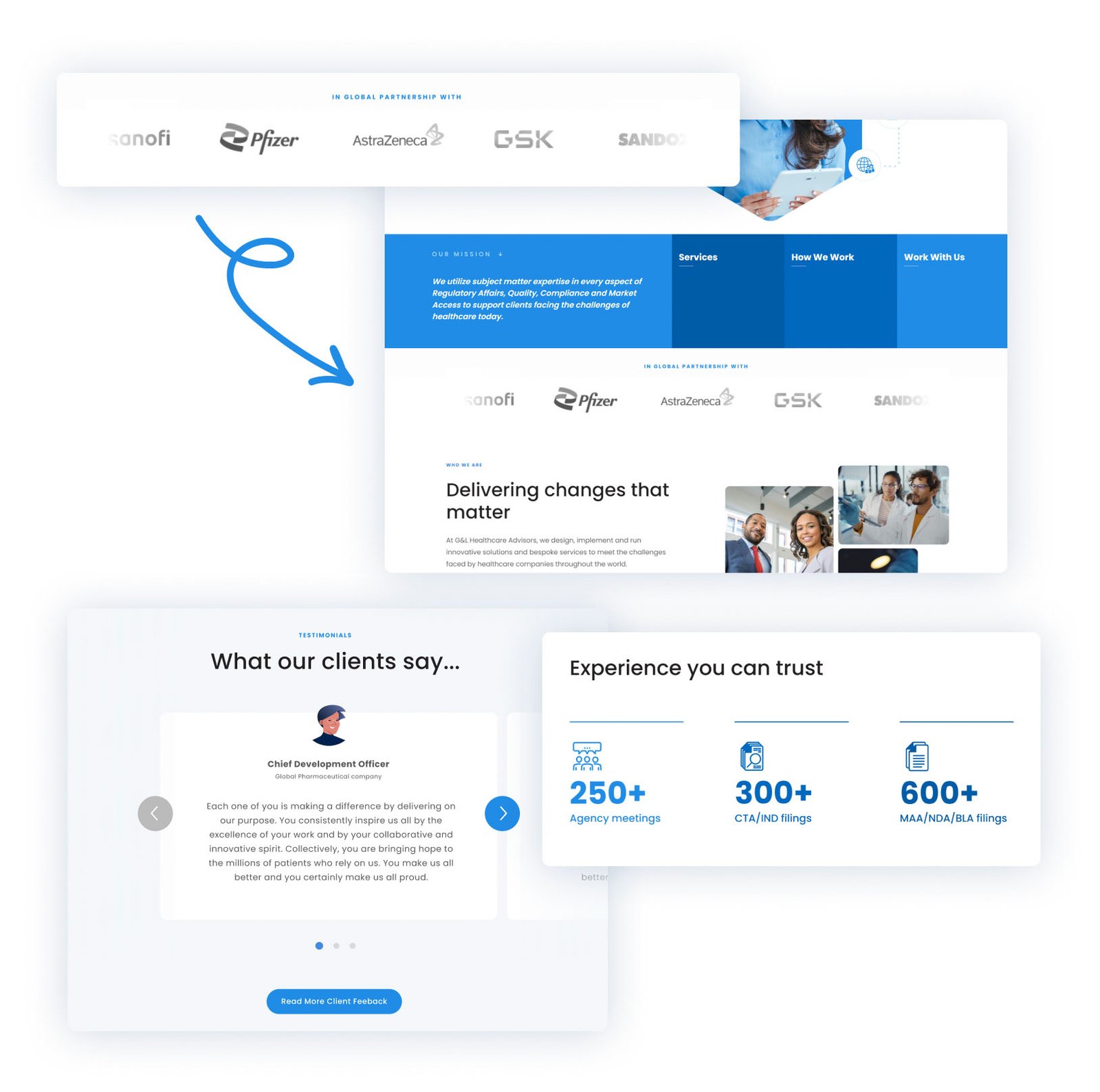
To strengthen credibility and reassure potential clients, I introduced: a dedicated social proof section, a statistics box and client testimony section to the homepage. Featuring client feedback, industry recognition and relevant affiliations, the section gives visitors immediate evidence of G&L Scientific’s expertise and reputation, helping to build confidence from the first interaction.
CONSISTENT COLLATERAL
One brand across every touchpoint
Marketing brochures, technical documents, presentations, exhibition graphics and promotional materials were redesigned using a unified visual system, creating a consistent customer experience both online and offline.
COMPANY LOGO
Reconnecting with the brand’s roots
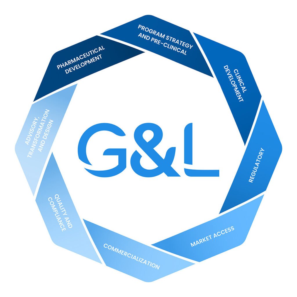
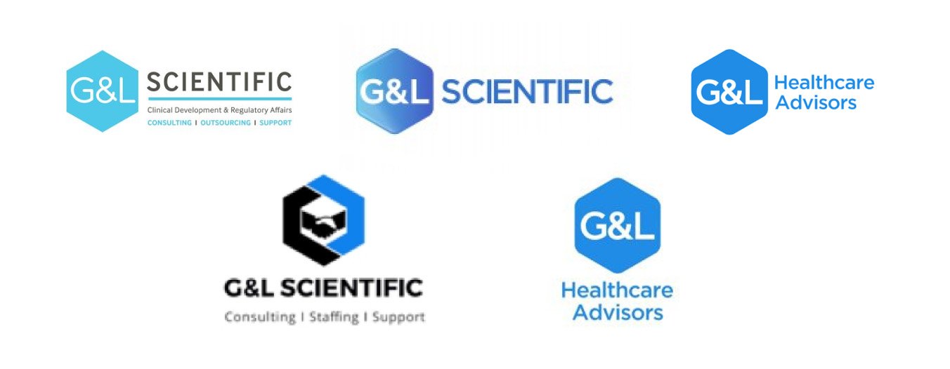
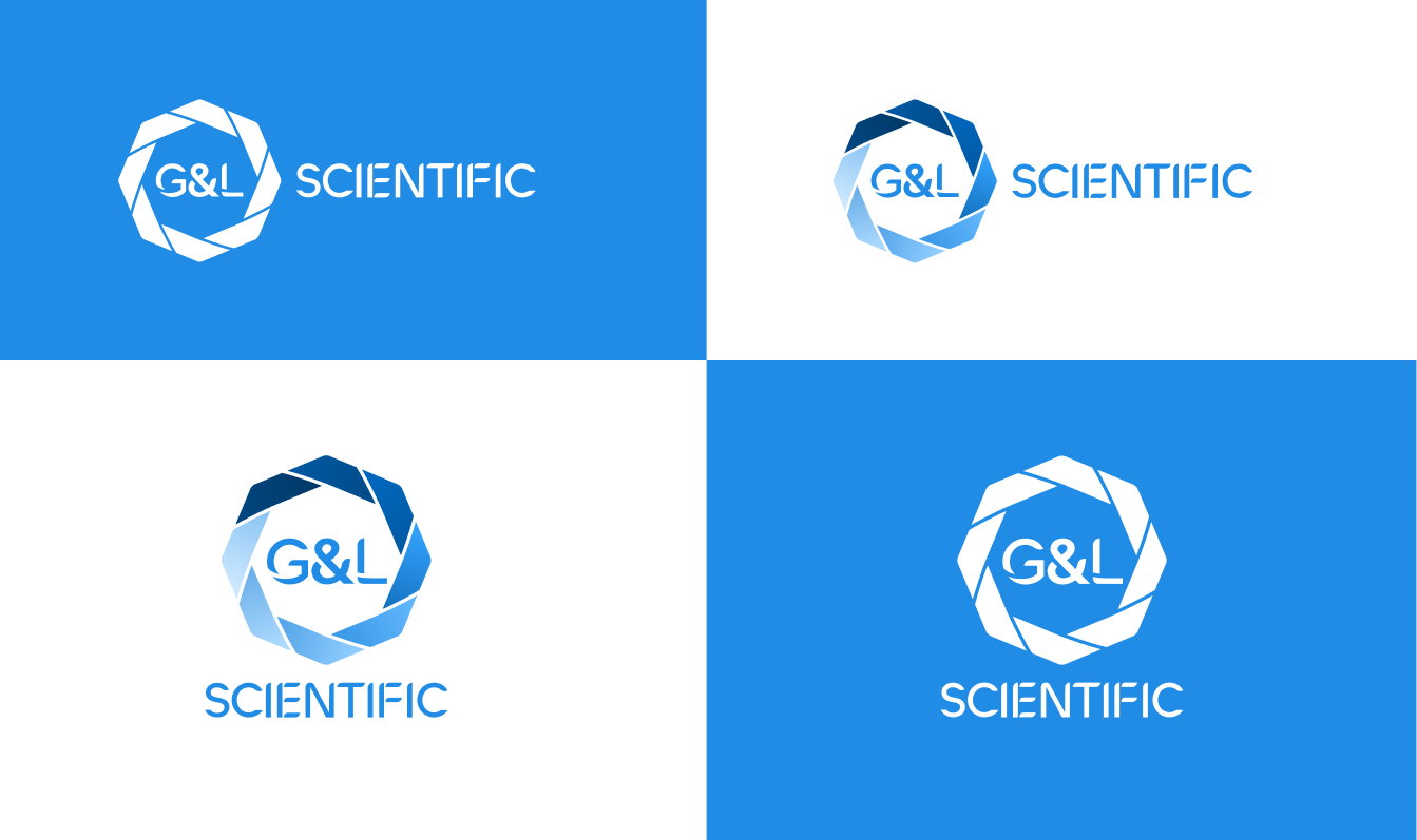
G&L Scientific originally operated under its current name before rebranding as G&L Healthcare Advisors for several years. When the company decided to return to the G&L Scientific name, the new identity needed to reconnect with the original brand while reflecting its evolution.
I developed the new logo loosely from the G&L Healthcare Advisors identity, retaining elements of familiarity while creating a cleaner, more contemporary mark for the renewed G&L Scientific brand.
WEBSITE HERO
Clearer first impression
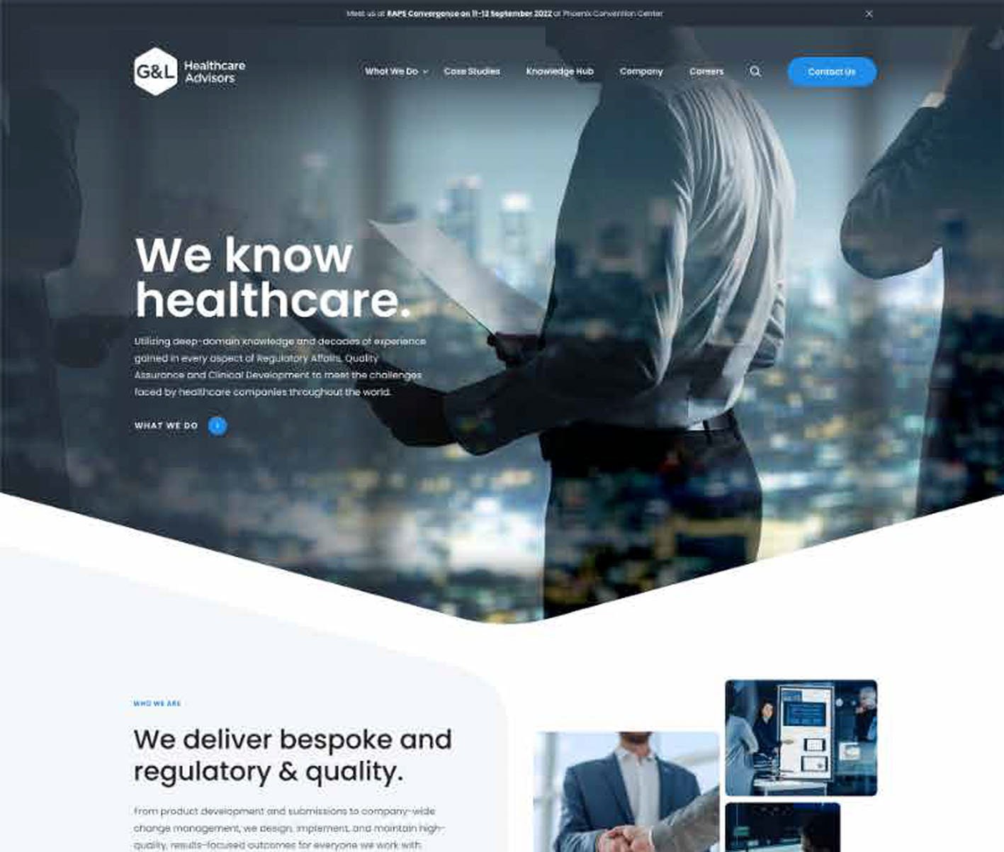
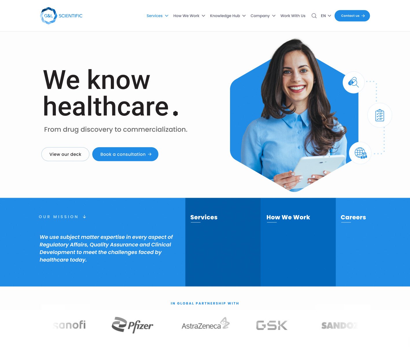
The website hero was redesigned to communicate G&L Scientific’s positioning immediately, with a stronger visual hierarchy and clearer messaging. The new approach creates a more confident first impression while giving visitors a clear route into the site.
Stakeholder feedback — representative:
“This feels much more like the company we are today. It’s cleaner and more welcoming, and showing real people rather than relying on dark, generic stock imagery gives it a much more human feel. It creates a stronger first impression when introducing G&L to new clients.”
WEBSITE NAVIGATION
Structuring the user journey
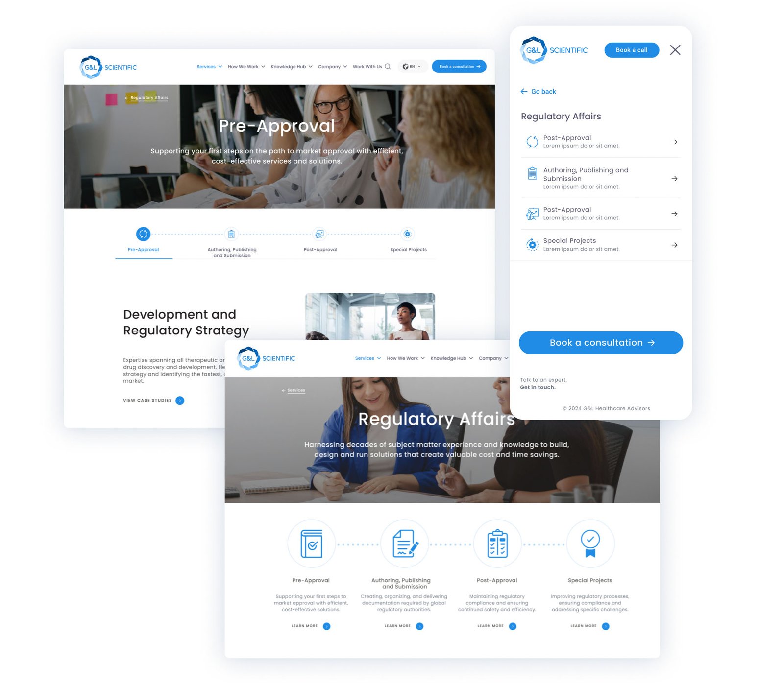
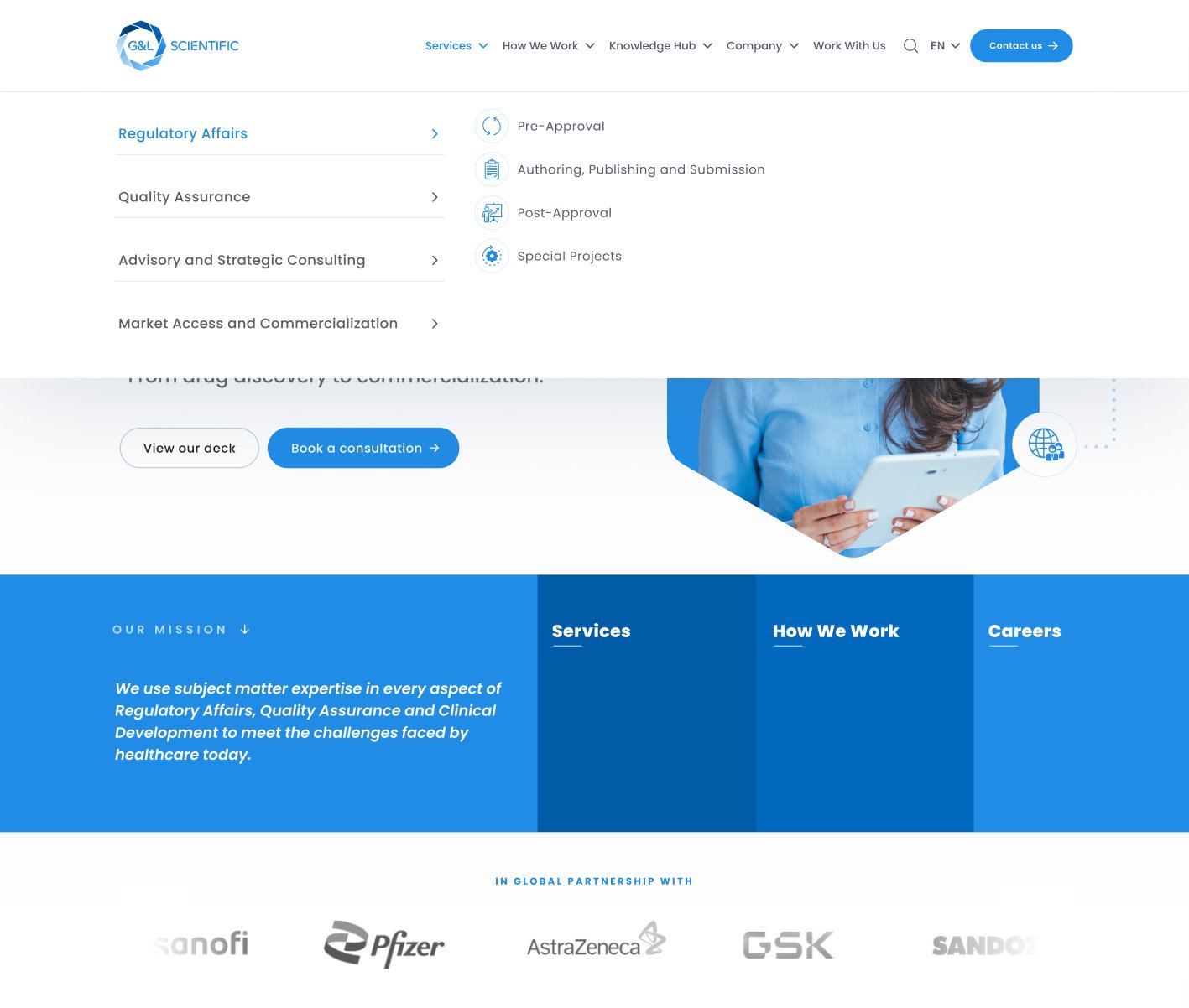
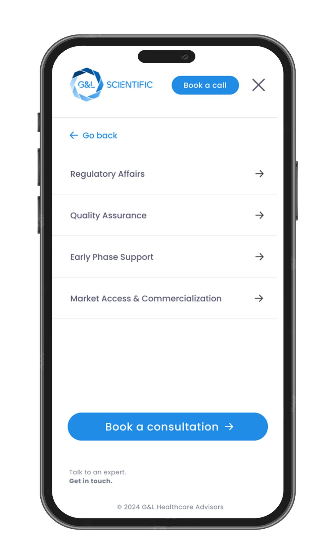
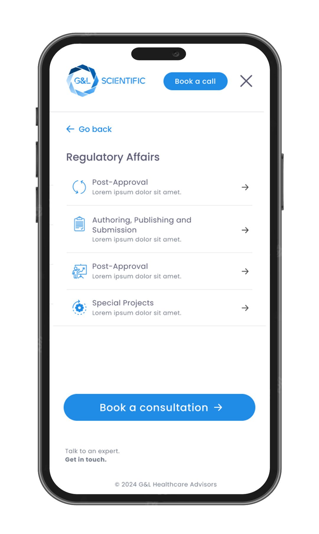
With G&L Scientific offering a wide array of services and specialist sub-services, the navigation was organised into clearer categories and hierarchy to help visitors understand the breadth of the company’s offering while providing intuitive pathways to the information most relevant to their needs.
Stakeholder feedback — representative:
“It’s much easier to see the full range of services now. The new navigation gives clients a clearer path through the different areas of the business without making the site feel overwhelming.”
KEY LEARNING
Consistency builds confidence
This project reinforced the importance of treating branding as a complete ecosystem rather than a collection of individual assets. By applying a consistent design language across every customer touchpoint, the company was able to present a stronger, more professional identity while improving the overall user experience.
NEXT STEPS
Continuing to evolve the brand
With the new brand identity and website established, further iterations will continue to improve the user experience as G&L Scientific’s services and needs evolve. Future development could focus on refining navigation, improving individual service pages, enhancing mobile interactions and introducing further content and functionality based on ongoing stakeholder and user feedback.