
How might we help angel investors make more meaningful and high-quality connections?
Aforja is an innovative social media platform crafted to foster authentic connections and meaningful interactions between angel investors, entrepreneurs and business mentors. The platform allows users to connect with like-minded individuals – forging friendships and nurturing communities as a necessary precursor to building great companies that last.
In this freelance project, I utilised the design thinking process to ensure Aforja offers a transformative experience for its users. Understanding the unique challenges faced by them, I approached the project with a user-centric mindset, striving to address their pain points and elevate their interactions on the platform.
ROLE
User Research
Product Design
PROCESS
Discover ➝ Define ➝
Develop ➝ Deliver
DELIVERABLE
Desktop
Mobile-Friendly Site
YEAR
2023
THE PROBLEM
An environment abundant in lack
Within the dynamic world of online investing, several key pain points persist for both seasoned investors and those just stepping into the market. Trust becomes a significant concern as the abundance of information and investment options can overwhelm even the most experienced investors. Quality investments often get buried under the sheer volume of choices, leading to missed opportunities and frustrations. Moreover, time becomes a scarce resource for investors who seek valuable insights without sifting through countless pitch decks and platforms.
KEY PAIN POINTS
01
Users feel a lack of connection and trust when using current online methods of making potential connections.
02
Users feel there is a consistent lack of quality in the majority of potential investment opportunities they currently see online.
03
Users find it difficult to research potential investment opportunities online due to a lack of time/bandwidth.
04
Users don’t feel a strong affinity or personal connection with the majority of potential investment opportunities.
THE CHALLENGE
Build meaningful bonds
In the realm of investment, where trust is paramount, my challenge is to craft a platform that not only establishes reliable and trustworthy connections but also reinforces the bonds of confidence among investors. The aim is to foster secure interactions, enabling investors to engage with aligned opportunities and establish relationships based on shared values. This ensures informed decisions backed by trust and thorough research.
“How might we facilitate high-quality relationships between investors and entrepreneurs, while helping them to achieve their investment goals?”
THE GOALS
01
Cultivate a strong community where investors can find relevant connections to meet their investing goals.
02
Ensure trust and transparency in all stages of the investment process.
03
Simplify the investing journey so that users with busy schedules can feel confident in their investments.
KEY SOLUTIONS

PEOPLE BEFORE PITCHES
No more wondering ‘Who are these people?’
On Aforja, we place the people behind the projects at the forefront, allowing for more authentic, long-lasting connections. Take part in weekly group calls and view weekly videos by founders for a sense of authentic connection.
VALUE-DRIVEN
Connect based on principles that drive you
Our platform is built upon the foundation of your principles. We ensure that each project resonates with your core beliefs, allowing you to invest in ventures that truly matter to you.

DUE DILIGENCE
Research streamlined when
your bandwidth is limited
Allow our team of experts to curate your perfect matches. Through diligent research and analysis, we ensure thorough project evaluation, saving you time while delivering a handpicked selection of prime opportunities.

BUILD TRUST
Elevate through collaborative governance
Participate in our interactive voting rounds and ranking system to shape the trajectory of fellow community members, fostering transparency and collective progress.

RESEARCH & KEY INSIGHTS
How are investors currently finding new investment opportunities?
To verify my assumptions and learn about the most common frustrations angel investors have, I conducted user research through the following steps:
ONLINE SURVEY
I conducted an online survey to find more realistic data about the target audience and garner interest for more in-depth interviews. The survey was also useful for screening out any investors without the specific experience of angel investing.
USER INTERVIEWS
Conversations I had with several angel investors helped me to gain a better understanding of potential users and understand the context of different use cases.
“I don’t have the bandwidth to invest my liquidity. A community that I could talk to and gain advice would accelerate my investing.”
Karim, CEO, 52
“If somebody I know commented on it then it gives it that validation.”
Tony, Angel Investor, 38
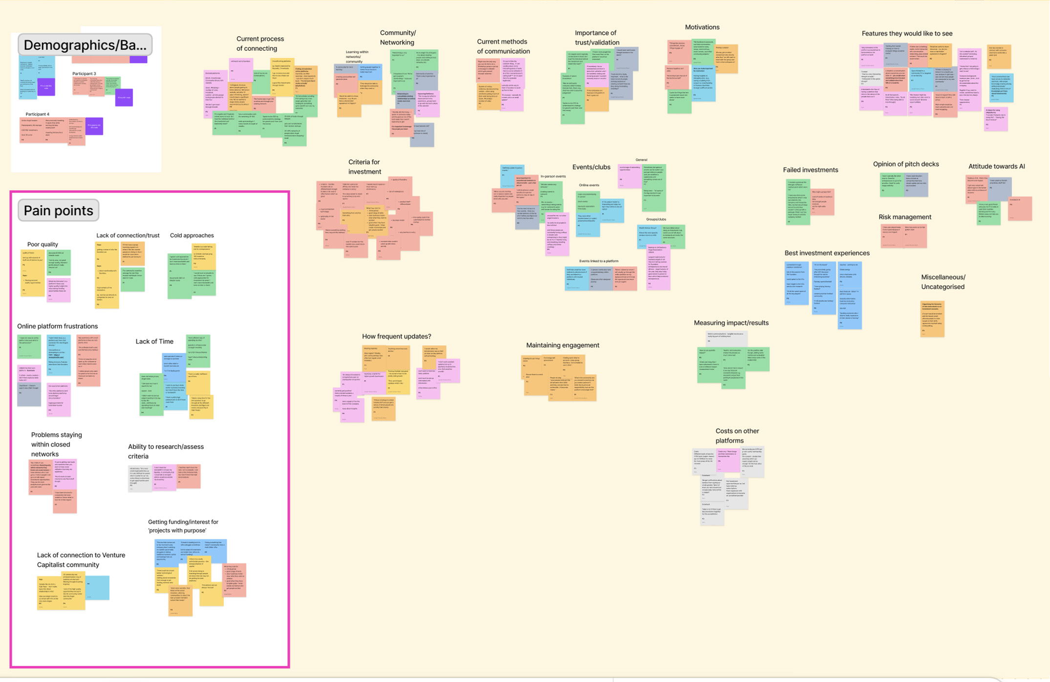
AFFINITY MAPPING
What are the common themes and frustrations experienced by investors?
After performing the user interviews, I collated the data and found several key areas where investors have difficulty with finding investment opportunities online.

USER PERSONAS
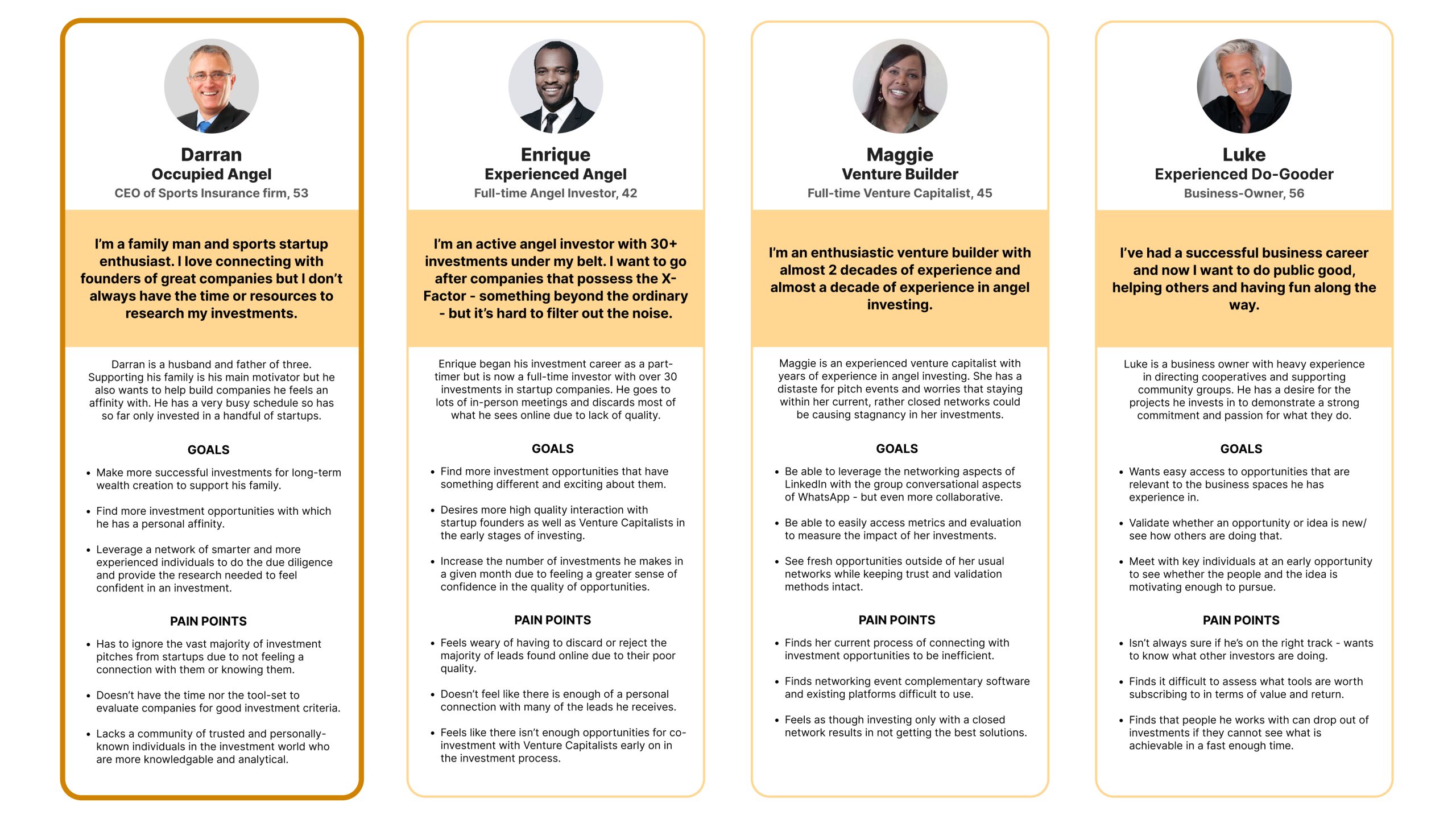
Who are the users?
Based on my research, I identified 4 personas that represent different investing styles, motivations, goals and pain points of potential users. The goal of creating user personas was to better understand the amplitude of these varying characteristics. I then identified Darran as the primary persona, as his were the most common goals and pain points likely to be felt by the majority of users of the platform. This persona was then used as the focus of further development.
EMPATHY MAPPING
What do users currently experience when making investments online?
After defining my primary persona, I empathised with the user’s attempt to perform a specific task in order to understand their current process; their goal for the task, and the actions, thoughts and feelings they experience while trying to undertake it. The following empathy map was drawn up around the task of finding new opportunities for investment online.

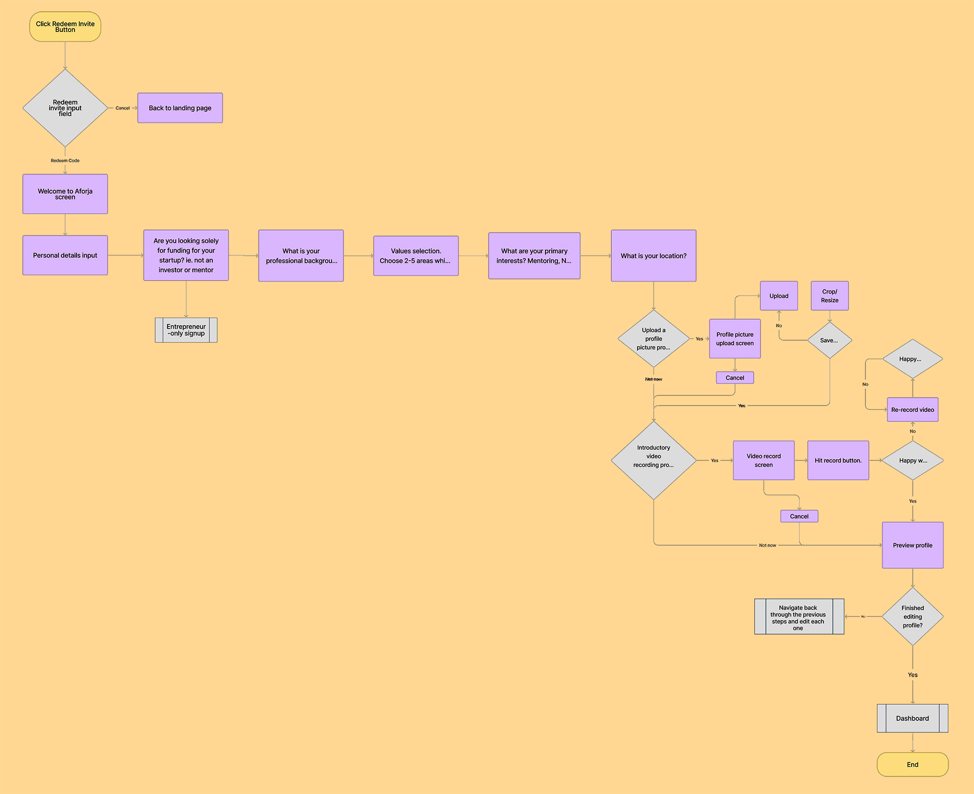
USER FLOW CHART
What flow would users experience?
I created a user flow chart with a use case scenario with the following tasks:
TASK ONE
Redeeming the invite code to join the site.
TASK TWO
Setting up their user profile and entering vital information for the platform’s matching system.
WIREFRAMES
What would the flow look like?
The next step in the process was to create low-fidelity wireframes to begin visualising what the user flow would look like on-site. I also started building wireframes for the main pages and dashboard.


DESIGN & ITERATION
Design, listen to users and iterate
After creating low-fidelity wireframes and developing initial high-fidelity screens to form a basic prototype, I performed some usability testing sessions with several participants from the target audience.
USER TESTING SCENARIO
“You are Evan, an angel investor who has received an invite code for Aforja. You want to redeem your invite code and set up your account on the platform.”
KEY LEARNINGS
01 Enhance user onboarding.
→ Offer comprehensive instructional and educational guidance to ensure users understand how to navigate and utilize the platform effectively.
02 Cultivate personalized experiences.
→ Deliver personalized and detailed information throughout the app, addressing specific user requirements and preferences to enrich their experience.
03 Elevate visual clarity.
→ Enhance user interface design by incorporating suitable graphic elements, providing users with an intuitive and visually clear platform interaction.
USERS SAY
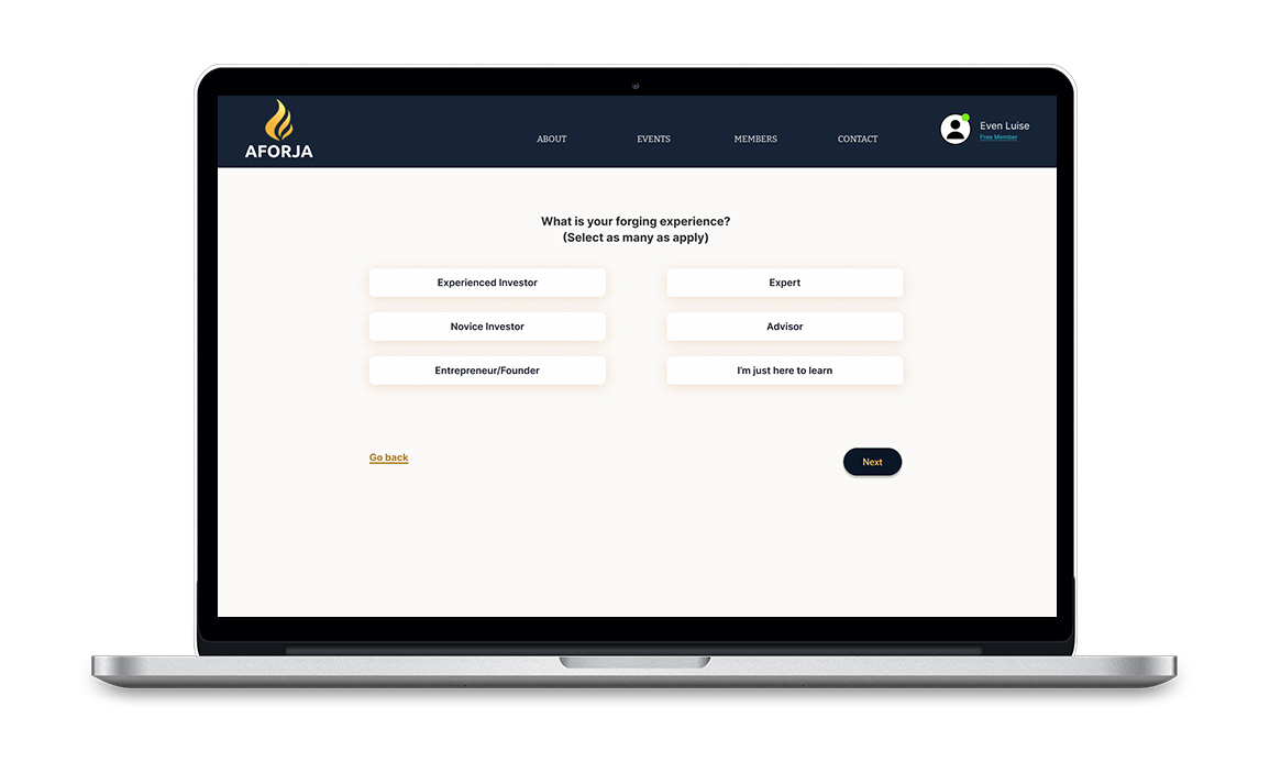
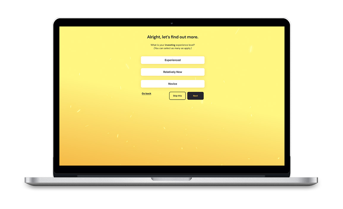
“The navigation header is too large – it takes up too much of the screen for investors and their 11-inch Macbook Airs.”
“I don’t understand what ‘forging experience’ is referring to. How it relates to the selectable options is a little unclear.”
→ I entirely removed the navigation header from this signup flow process and opted for a more minimal layout. I also changed the copy wording so that it is more clear that the user is being asked to provide their investing experience.


USERS SAY
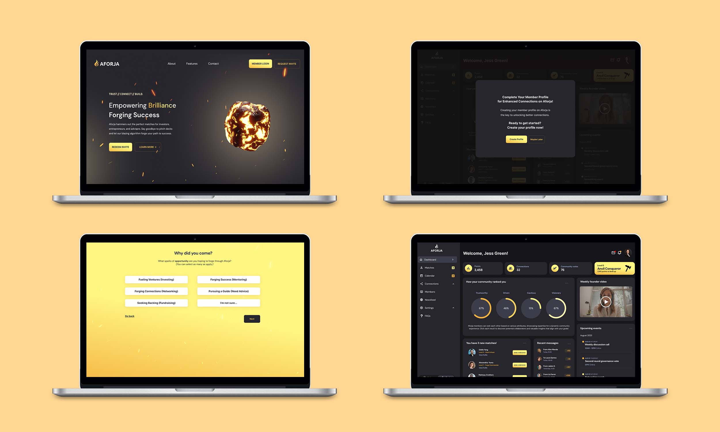
“I would expect to see more updates on the dashboard about my potential matches and my interactions with them.”
“I would expect to see less financial information on the dashboard, since the platform is more about social networking and connecting with others.”
→ I updated the initial dashboard design so that it wasn’t so heavily focused on investment information and figures. I added widgets that were more related to the social interaction aspects of the platform, such as the points and levels system, the ranking system, messages and matches with other members.

USERS SAY
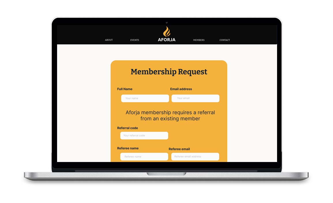
“The difference between the landing page theme and the rest of the pages is a bit jarring and strange.”
“The gold colour theme would appeal to people with a lot of wealth – it reminds me of Dubai investor clubs.”
→ I amended the main site pages and dashboard so that they match the dark theme of the landing page. I adjusted the gold accent colour to be more yellow in tone, so it looks less like the colours used by a competitor. I also made it less dominant on the dashboard to create a more sleek and minimal interface, and ensured that it is used in a more accessibility-friendly way.
KEY LEARNING
Listening to users is key
Throughout each phase of Aforja’s development, placing users at the center of the design process was essential. By carefully listening to their needs and insights, it was possible to design a platform that considers and addresses their requirements. This approach will ensure that Aforja is an authentic reflection of its community’s values, resulting in an experience that is both functional and meaningful.
NEXT STEPS
Increase momentum and forge deeper connections
Continuing to develop Aforja remains pivotal in nurturing deeper connections with its community members. As Afroja evolves, it is important to ensure that the platform consistently aligns with the evolving needs and aspirations of its users. By enhancing features, refining user experiences, and fostering an environment that encourages transparency and dialogue, it is possible to amplify the sense of belonging and shared purpose within the community, creating an environment that users will want to return to.
NEXT PROJECT
The Green Bicycle Company➝
(COMING SOON)